I love making custom cards. But sometimes my pictures don't always fit into the SendOutCards.com template like I would like them to. So I have learned how to make them press-ready in Inkscape.
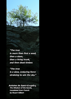
Here's an example of a card I designed from my hike up Battlecreek Canyon last week. The original picture was super long and skinny, which made a perfect place for me to place a nice quote. However, when I imported it into Picture Plus, I couldn't see the whole quote.
Rather than leave matters to chance, I prefer to lay the card out on the dimensions it will ultimately be printed on, in my case 5.375 x 7.5 inches.
To do this, I open Inkscape and then open the file menu to adjust the Document Properties. When that box opens, I change the Custom Width and Height to 5.375 x 7.5.
Now I need a backdrop. Black seems to suit the picture, so I use a rectangle tool to make a large black rectangle as big as the card dimensions. I can change the color of the inside ("Fill") and outline ("Stroke") of the rectangle by choosing Fill and Stroke from the Object menu and making the Fill and Stroke whatever color I want. I can also change the rectangle's color by choosing from the colors down at the bottom of the screen while I have the rectangle selected.
After the black background is in place, I import my tree picture, which I had previously edited and cropped in Gimp. I have to resize it a bit, though, because the .jpg picture file I have is set at a pretty high resolution. In order to shrink it down without accidentally making the picture distorted, I select the picture, hold down CRTL and then resize the picture. Holding down CTRL keeps the proportion of length and width the same, no matter how big or small you make it.
When the picture is the right size, I try moving it around different places on the background. I finally settle on a spot left of center.
Now for the finishing touch: the text. The A symbol on the left side of Inkscape is a Text tool. Use it to create the size of text block that you want, and then start typing. In order to change the font and size of the text you have selected, open the Text and Font dialogue from the Text menu. You can resize your text box at any time if you run out of room. Just click on the diamond on the lower right corner of the text box and move it around until you get the right size and shape that you want. (I will write more on typography soon.)
Lastly, in order for this file to work in Picture Plus, I need to Export the file to Bitmap. The normal file format for Inkscape files is .svg, but it is not compatible with many things. When I choose this option from the File menu, I can choose what I want to call the bitmap file, whether to export the page dimensions or the whole drawing, and also change the resolution of the final piece. I usually choose to export the Page and make the resolution 600 dpi, which is a good size for printing. If I were putting it on the web, I might use 90 dpi. The exported file is a .png, which is easily recognizable by most programs.
Have fun Inking around!


